
Due to Twitter's algorithm, this is a manual re-direct to my post:
Due to Twitter's algorithm, this is a manual re-direct to my post:

Since Twitter has disabled likes, retweets, and replies to posts with substack links this is a manual re-direct via blogspot:
https://infoeqm.substack.com/p/employment-situation-core-unemployment


This post acts as a collection of links to find me in various places for various content. This econ blog has been moved (along with the archives) over to my substack Information Equilibrium. It's free to sign up (and definitely more likely to get to you than twitter ever was).
I also have an account on mastodon:
I started a bluesky:
Deactivated my twitter!
I continue to post on twitter @infotranecon (for econ and politics) and @newqueuelure (for sci fi and game stuff)
Noah Smith made a stir with his claim that historians make theories without empirical backing — something I think is a bit of a category error. I mean even if historian's "theories" truly are "it happened in the past, so this can happen again", that the study of history gives us a sense of the available state space of human civilization, then that observation is such a small piece of the available state space as to carry zero probability on its own. You'd have to resort to some kind of historical anthropic principle that the kind of states humans have seen in the past are the more likely ones when you have a range of theoretical outcomes comparable to the string theory landscape [1]. But that claim is so dependent on its assumption it could not rise to the idea of a theory in empirical science.
For example, a common finding in the literature on education production is that children in smaller classes tend to do worse on standardized tests, even after controlling for demographic variables. This apparently perverse finding seems likely to be at least partly due to the fact that struggling children are often grouped into smaller classes.
... we would like students to have similar family backgrounds when they attend schools with grade enrollments of 35–39 and 41–45 [on either side of the 40 students per class cutoff]. One test of this assumption... is to estimate effects in an increasingly narrow range around the kink points; as the interval shrinks, the jump in class size stays the same or perhaps even grows, but the estimates should be subject to less and less omitted variables bias.
 |
| Average class size in the case of a maximum of 40 students versus enrollment. |


Per a question in my Twitter DMs, I thought I'd do a comparison between the Dynamic Information Equilibrium Model (DIEM) and the FRB/US model of the unemployment rate. I've not done this comparison that I can recall. I've previously looked at point forecast comparisons between the different Fed models (e.g. here for 2014). In another post, I took the DIEM model through the Great Recession following along with the Fed Greenbook forecasts. And in an even older post (prior to the development of the DIEM), I looked at inflation forecasts from the FRB/US model.
The latest and most relevant Fed Tealbook forecast from the FRB/US model that seems to be available is here [pdf] — it's from December 2015. I've excerpted the unemployment rate forecast (along with several counterfactuals) in the following graphic:

Now something that should be pointed out is that the FRB/US model does a lot more than the unemployment rate — GDP, interest rates, inflation, etc. While there are separate models in the information equilibrium framework covering a lot of those measures, the combination of the empirically valid relationships into a single model is still incomplete (see here). However, in the DIEM the unemployment rate is essentially unaffected by other variables in equilibrium (declining at the equilibrium rate of d/dt log u ≃ −0.09/y [0]). Therefore, whatever the other variables in an eventual information equilibrium macro model, comparing the unemployment rate forecasts alone should be valid — especially since we are going to look at the period 2016 to 2020 (prior to the COVID shock).
Setting the forecast date to be the end of Q3 of 2015 just prior to the meeting, we can see the central forecast for the DIEM does worse at first but is better over the longer run (click to enlarge):

The big difference lies not just in the long run but in the error bands, with the DIEM being much narrower. These are apples-to-apples error bands as we can see the baseline FRB/US forecast in the graph at the top of the post is conditional on a lack of a recessionary shock (those are the red and purple lines above) [1].
Additional differences come in what we don't see. Looking at the latest 2018 update to the FRB/US model, we get information about the impulse responses to a 100 bp increase in the Fed funds rate. Now the Fed usually doesn't do 100 bp changes (typically 25 bp), so this is a large shock. But it also creates a forecast path that looks nothing like anything we have seen in the historical data [3]:


And while yes this 0.7 pp increase in the unemployment rate is following a 100 bp increase in Fed funds rate when we usually see only 25 bp increases [4], this would, per the Sahm Rule, indicate a recession — and therefore almost certainly further increases beyond the initial 0.7 pp.
Now it is true we don't see the unemployment rate falling continuously, asymptotically approaching zero, as would be indicated in the DIEM. However, we also haven't had a period of 40 years uninterrupted by a recession required for it to happen.
The FRB/US model has hundreds of parameters for hundreds of variables — however, it doesn't even qualitatively capture the behavior of the empirical data for the unemployment rate. This is likely due to what Noah Smith called "big unchallenged assumptions" — in order to get an unemployment rate path to look more like the data, trade-offs would have to be made on other variables that make them look far worse. You could probably come up with something that looks a lot like the FRB/US model with a giant system of linear equations with several lags. Simultaneously fitting all of variables you chose to model can create results that look not entirely implausible when you look at all the model outputs as a group, but individually do not qualitatively describe what we see. The reason? You chose (and probably constrained) several variables to have relationships that are empirically invalid — therefore any fit is going to have variables that come out looking wrong.
I imagine the impact of an increase in the Fed funds rate on the unemployment rate is one of those chosen relationships. Looking through the historical data, there is no particular evidence that raising rates causes unemployment to rise nor vice versa. In fact, it seems rising unemployment causes the Fed to start lowering rates [5]! But forcing such a relationship, after estimating all the model parameters, likely contributes to not just forecasting error, but making the unemployment rate do strange things.
...
Footnotes
[0] See also Hall and Kudlyak (2020) which arrives at the same rate of decline.
[1] Here's what a recession shock of the same onset would look like in the DIEM (click to enlarge):


[3] I based the counterfactual "no rate increase" on the typical flattening we see in other FRB/US forecasts. It's really not a big difference to just use the last 2020 data point and say the future is constant as the counterfactual (click to enlarge):


From my "Limits to wage growth" post from roughly three years ago:
If we project wage growth and NGDP growth using the models, we find that they cross-over in the 2019-2020 time frame. Actually, the exact cross-over is 2019.8 (October 2019) which not only eerily puts it in October (when a lot of market crashes happen in the US) but also is close to the 2019.7 value estimated for yield curve inversion based on extrapolating the path of interest rates. ...
This does not mean the limits to wage growth hypothesis is correct — to test that hypothesis, we'll have to see the path of wage growth and NGDP growth through the next recession. This hypothesis predicts a recession in the next couple years (roughly 2020).
We did get an NBER declared recession in 2020, but since I have ethical standards (unlike some people) I will not claim this as a successful model prediction as the causal factor is pretty obviously COVID-19. So when is the next recession going to happen? 2027.
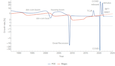
Let me back up a bit and review the 'limits to wage growth' hypothesis. It says that when nominal wage growth reaches nominal GDP (NGDP) growth, a recession follows pretty quickly after. There is a Marxist view that when wage growth starts to eat into firms' profits, investment declines, which triggers a recession. That's a plausible mechanism! However, I will be agnostic about the underlying cause and treat it purely as an empirical observation. Here's an updated version of the graph from the original post (click to enlarge). We see that recessions (beige shaded regions) occur roughly where wage growth (green) approaches NGDP growth (blue) — indicated by the vertical lines and arrows.


Epilogue
One reason I thought about looking back at this hypothesis was a blog post from David Glasner, writing about an argument about the price stickiness mechanism in (new) Keynesian models [1]. I found myself reading lines like "wages and prices are stuck at a level too high to allow full employment" — something I would have seen as plausible several years ago when I first started learning about macroeconomics — and shouting (to myself, as I was on an airplane) "This has no basis in empirical reality!"
Wage growth declines in the aftermath of a recession and then continues with its prior log growth rate of 0.04/y. Unemployment rises during a recession and then continues with its prior rate of decline −0.09/y [2]. These two measures are tightly linked. Inflation falls briefly about 3.5 years after a decline in labor force participation — and then continues to grow at 1.7% (core PCE) to 2.5% (CPI, all items).
These statements are entirely about rates, not levels. And if the hypothesis above is correct, the causality is backwards. It's not the failing economy reducing the level of wages that can be supported at full employment — the recession is caused by wage growth exceeding NGDP growth, which causes unemployment to rise, which then causes wage growth to decline about 6 months later.
Additionally, since both NGDP and wages here are nominal monetary policy won't have any impact on this mechanism. And empirically, it doesn't. While the social effect of the Fed may stave off the panic in a falling market and rising unemployment, once the bottom is reached and the shock is over the economy (over the entire period for which we have data) just heads back to its equilibrium −0.09/y log decline in unemployment and +0.04/y log increase in wage growth.
Of course this would mean the core of Keynesian thinking about how the economy works — in terms of wages, prices, and employment — is flawed. Everything that follows from The General Theory from post-Keynesian schools to the neoclassical synthesis to new Keynesian DSGE models to monetarist ideology is fruit of a poisonous tree.
Keynes famously said we shouldn't fill in the values:
In chemistry and physics and other natural sciences the object of experiment is to fill in the actual values of the various quantities and factors appearing in an equation or a formula; and the work when done is once and for all. In economics that is not the case, and to convert a model into a quantitative formula is to destroy its usefulness as an instrument of thought.
No wonder his ideas have no basis in empirical reality!
...
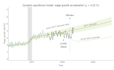
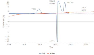
Update 19 November 2021
The stimulus of 2021 seems to have pushed up both GDP growth and wage growth. In fact, wage growth appears to have returned to its prior equilibrium:
...
Footnotes:
[1] Also, wages / prices aren't individually sticky. The distribution of changes might be sticky (emergent macro nominal rigidity), but prices or wages that change by 20% aren't in any sense "sticky".
[2] Something Hall and Kudlyak (Nov 2020) picked up on somewhat after I wrote about it (and even used the same example).
One of the benefits of the information equilibrium approach to economics is that it makes several of the implicit assumptions explicit. Over the past couple days, I was part of an exchange with Theodore on twitter that started here where I learned something new about how people who have studied economics think about it — and those implicit assumptions. Per his blog, Theodore says he works in economic consulting so I imagine he has some advanced training in the field.

The good old supply and demand diagram used in Econ 101 has a lot of implicit assumptions going into it. I'd like to make a list of some of the bigger implicit assumptions in Econ 101 and how the information transfer framework makes them explicit.
I. Macrofoundations of micro
Theodore doesn't think the supply and demand curves in the information transfer framework [1] are the same thing as supply and demand curves in Econ 101. Part of this is probably a physicist's tendency to see any isomorphic system in terms of effect as the same thing. Harmonic oscillators are basically the same thing even if the underlying models — from a pendulum, to a spring, to a quantum field [pdf] — result from different degrees of freedom.
One particular difference Theodore sees is that in the derivation from the information equilibrium condition $I(D) = I(S)$, the supply curve has parameters that derive from the demand side. He asks:
For any given price you can draw a traditional S curve, independent of [the] D curve. Is it possible to draw I(S) curve independent of I(D)?
Now Theodore is in good company. A University of London 'Econ 101' tutorial that he linked me to also says that they are independent:
It is important to bear in mind that the supply curve and the demand curve are both independent of each other. The shape and position of the demand curve is not affected by the shape and position of the supply curve, and vice versa.
I was unable to find a similar statement in any other Econ 101 source, but I don't think the tutorial statement is terribly controversial. But what does 'independent' mean here?
In the strictest sense, the supply curve in the information transfer framework is independent of demand independent variables because you effectively integrate out demand degrees of freedom to produce it, leaving only supply and price. Assuming constant $S \simeq S_{0}$ when integrating the information equilibrium condition:
$$\begin{eqnarray}\int_{D_{ref}}^{\langle D \rangle} \frac{dD'}{D'} & = & k \int_{S_{ref}}^{\langle S \rangle} \frac{dS'}{S'}\\
& = & \frac{k}{S_{0}} \int_{S_{ref}}^{\langle S \rangle} dS'\\
& = & \frac{k}{S_{0}} \left( \langle S \rangle - S_{ref}\right)\\
\log \left( \frac{\langle D \rangle}{D_{ref}}\right) & = & \frac{k}{S_{0}} \Delta S
\end{eqnarray}$$
If we use the information equilibrium condition $P = k \langle D \rangle / S_{0}$, then we have an equation free of any demand independent variables [2]:
$$\text{(1)}\qquad \Delta S = \frac{S_{0}}{k} \log \left(\frac{P S_{0}}{k D_{ref}}\right)There's still that 'reference value' of demand $D_{ref}$, though. That's what I believe Theodore is objecting to. What's that about?
It's one of those implicit assumptions in Econ 101 made explicit. It represents the background market required for the idea of a price to make sense. In fact, we show this more explicitly by recognizing the the argument of the log in Eq. (1) is dimensionless. We can define a quantity with units of price (per the information equilibrium condition) $P_{ref} = k D_{ref} / S_{0}$ such that:
$$This constant sets the scale of the price. What units are prices measured in? Is it 50 € or 50 ¥? In this construction, the price is set around a market equilibrium price in that reference background. The supply curve is the behavior of the system for small perturbations around that market equilibrium when demand reacts faster than supply such that the information content of the supply distribution stays approximately constant at each value of price (just increasing the quantity supplied) where the scale of prices doesn't change (for example, due to inflation).
This is why I tried to ask about what the price $P$ meant in Theodore's explanations. How can a price of a good in the supply curve mean anything independently of demand? You can see the implicit assumptions of a medium of exchange, a labor market, production capital, and raw materials in his attempt to show that the supply curve is independent of demand:
The firm chooses to produce [quantity] Q to maximize profits = P⋅Q − C(Q) where C(Q) is the cost of producing Q. [T]he supply curve is each Q that maximizes profits for each P. The equilibrium [market] price that firms will actually end up taking is where the [supply] and [demand] curves intersect.
There's a whole economy implicit in the definition profits $ = P Q - C(Q)$. What are the units of $P$? What sets its scale? [4] Additionally, the profit maximization implicitly depends on the demand for your good.
I will say that Theodore's (and the rest of Econ 101's) explanation of a supply curve is much more concrete in the sense that it's easy for any person who has put together a lemonade stand to understand. You have costs (lemons, sugar) and so you'll want to sell the lemonade for more than the cost of the lemons based on how many glasses you think you might sell. But one thing it's not is independent of a market with demand and a medium of exchange.
Some of the assumptions going into the Theodore's supply curve aren't even necessary. The information transfer framework has a useful antecedent in Gary Becker's paper Irrational Behavior in Economic Theory [Journal of Political Economy 70 (1962): 1--13] that uses effectively random agents (i.e. maximum entropy) to reproduce supply and demand. I usually just stick with the explanation of the demand curve because it's far more intuitive, but there's also the supply side. That was concisely summarized by Cosma Shalizi:
... the insight is that a wider range of productive techniques, and of scales of production, become profitable at higher prices. This matters, says Becker, because producers cannot keep running losses forever. If they're not running at a loss, though, they can stay in business. So, again without any story about preferences or maximization, as prices rise more firms could produce for the market and stay in it, and as prices fall more firms will be driven out, reducing supply. Again, nothing about individual preferences enters into the argument. Production processes which are physically perfectly feasible but un-profitable get suppressed, because capitalism has institutions to make them go away.
Effectively, as we move from a close-in production possibilities frontier (lower prices) to a far-out one (higher prices), the state space is simply larger [5]. This increasing size of the state space with price is what is captured in Eqs. (1) and (2), but it critically depends on setting a scale of the production possibilities frontier via the background macroeconomic equilibrium — we are considering perturbations around it.
David Glasner [6] has written about these 'macrofoundations' of microeconomics, e.g. here in relation to Econ 101. A lot of microeconomics makes assumptions that are likely only valid near a macroeconomic equilibrium. This is something that I hope the information transfer framework makes more explicit.
II. The rates of change of supply and demand
There is an assumption about the rates of change of the supply and demand distributions made leading to Eq. (1) above. That assumption about whether supply or demand is adjusting faster [2] when you are looking at supply and demand curves is another place where the information transfer framework makes an implicit Econ 101 assumption explicit — and does so in a way that I think would be incredibly beneficial to the discourse. In particular, beneficial to the discussion of labor markets. As I talk about at the link in more detail, the idea that you could have e.g. a surge of immigration and somehow classify it entirely as a supply shock to labor, reducing wages, is nonsensical in the information transfer framework. Workers are working precisely so they can pay for things they need, which means we cannot assume either supply or demand is changing faster; both are changing together. Immediately we are thrown out of the supply and demand diagram logic and instead are talking about general equilibrium.

III. Large numbers of inscrutable agents
Of course there is the even more fundamental assumption that an economy is made up of a huge number of agents and transactions. This explicitly enters into the information transfer framework twice: once to say distributions of supply and demand are close to the distributions of events drawn from those distributions (Borel law of large numbers), and once to go from discrete events to the continuous differential equation.
This means supply and demand cannot be used to understand markets in unique objects (e.g. art), or where there are few participants (e.g. labor market for CEOs of major companies). But it also means you cannot apply facts you discern in the aggregate to individual agents — for example see here. An individual did not necessarily consume fewer blueberries because of a blueberry tax, but instead had their own reasons (e.g. they had medical bills to pay, so could afford fewer blueberries) that only when aggregated across millions of people produced the ensemble average effect. This is a subtle point, but comes into play more when behavioral effects are considered. Just because a behavioral explanation aggregates to a successful description of a macro system, it does not mean the individual psychological explanation going into that behavioral effect is accurate.
Again, this is made explicit in the information transfer framework. Agents are assumed to be inscrutable — making decisions for reasons we cannot possibly know. The assumption is only that agents fully explore the state space, or at least that the subset of the state space that is fully explored is relatively stable with only sparse shocks (see the next item). This is the maximum entropy / ergodic assumption.
IV. Equilibrium
Another place where implicit assumptions are made explicit is equilibrium. The assumption of being at or near equilibrium such that $I(D) \simeq I(S)$ is even in the name: information equilibrium. The more general approach is the information transfer framework where $I(D) \geq I(S)$ and e.g prices fall below ideal (information equilibrium) prices. I've even distinguished these in notation, writing $D \rightleftarrows S$ for an information equilibrium relationship and $D \rightarrow S$ for an information transfer one.
Much like the concept of macrofoundations above, the idea behind supply and demand diagrams is that they are for understanding how the system responds near equilibrium. If you're away from information equilibrium, then you can't really interpret market moves as the interplay of supply and demand (e.g. for prediction markets). Here's David Glasner from his macrofoundations and Econ 101 post:
If the analysis did not start from equilibrium, then the effect of the parameter change on the variable could not be isolated, because the variable would be changing for reasons having nothing to do with the parameter change, making it impossible to isolate the pure effect of the parameter change on the variable of interest. ... Not only must the exercise start from an equilibrium state, the equilibrium must be at least locally stable, so that the posited small parameter change doesn’t cause the system to gravitate towards another equilibrium — the usual assumption of a unique equilibrium being an assumption to ensure tractability rather than a deduction from any plausible assumptions – or simply veer off on some explosive or indeterminate path.
In the dynamic information equilibrium model (DIEM), there is an explicit assumption that equilibrium is only disrupted by sparse shocks. If shocks aren't sparse, there's no real way to determine the dynamic equilibrium rate $\alpha$. This assumption of sparse shocks is similar to the assumptions that go into understanding the intertemporal budget constraint (which also needs to have an explicit assumption that consumption isn't sparse).
Summary
Econ 101 assumes a lot of things — from the existence of a market and a medium of exchange, to being in an approximately stable macroeconomy that's near equilibrium, to the rates of change of supply and demand in response to each other, to simply the existence of a large number of agents.
This is usually fine — introductory physics classes often assume you're in a gravitational field, near thermodynamic equilibrium, or even a small cosmological constant such that condensed states of matter exist. Econ 101 is trying to teach students about the world in which they live, not an abstract one where an economy might not exist.
The problem comes when you forget these assumptions or try to pretend they don't exist. A lot of 'Economism' (per James Kwak's book) or '101ism' (see Noah Smith) comes from not recognizing the conclusions people drawn from Econ 101 are dependent on many background assumptions that may or may not be valid in any particular case.
Additionally, when you forget the assumptions you lose understanding of model scope (see here, here, or here). You start applying a model where it doesn't apply. You start thinking that people who don't think it applies are dumb. You start thinking Econ 101 is the only possible description of supply and demand. It's basic Econ 101! Demand curves slope down [7]! That's not a supply curve!
...
Footnotes:
[1] The derivation of the supply and demand diagram from information equilibrium is actually older than this blog — I had written it up as a draft paper after working on the idea for about two years after learning about the information transfer framework of Fielitz and Borchardt. I posted the derivation on the blog the first day eight years ago.
[2] In fact, a demand curve doesn't even exist in this formulation because we assumed the time scale $T_{D}$ of changes in demand is much shorter than the time scale $T_{S}$ of changes in supply (i.e. supply is constant, and demand reacts faster) — $T_{S} \gg T_{D}$. In order to get a demand curve, you have to assume the exact opposite relationship $T_{S} \ll T_{D}$. The two conditions cannot be simultaneously true [3]. The supply and demand diagram is a useful tool for understanding the logic of particular changes in the system inputs, but the lines don't really exist — they represent counterfactual universes outside of the equilibrium.
[3] This does not mean there's no equilibrium intersection point — it just means the equilibrium intersection point is the solution of the more general equation valid for $T_{S} \sim T_{D}$. And what's great about the information equilibrium framework is that the solution, in terms of a supply and demand diagram, is in fact a point because $P = f(S, D)$ — one price for one value of the supply distribution and one value of the demand distribution.
[4] This is another area where economists treat economics like mathematics instead of as a science. There are no scales, and if you forget them sometimes you'll take nonsense limits that are fine for a real analysis class but useless in the real world where infinity does not exist.
[5] For some fun discussion of another reason economists give for the supply curve sloping up — a 'bowed-out' production possibilities frontier — see my post here. Note that I effectively reproduce that using Gary Becker's 'irrational' model by looking at the size of the state space as you move further out. Most of the volume of a high dimensional space is located near its (hyper)surface. This means that selecting a random path through it, assuming you can explore most of the state space, will land near that hypersurface.
[6] David Glasner is also the economist who realized the connections between information equilibrium and Gary Becker's paper.
[7] Personally like Noah Smith's rejoinder about this aspect of 101ism — econ 101 does say they slope down, but not necessarily with a slope $| \epsilon | \sim 1$. They could be almost completely flat. There's nothing in econ 101 to say otherwise. PS — had a conversation about demand curves with our friend Theodore as well earlier this year.